Each year the Pantone Color Institute selects a colour, determined through trend analysis and careful consideration of current influences across the globe, to represent the times.
For 2020 this is Classic Blue (Pantone 19-4052), which Pantone says highlights “our desire for a dependable and stable foundation on which to build as we cross the threshold into a new era”.
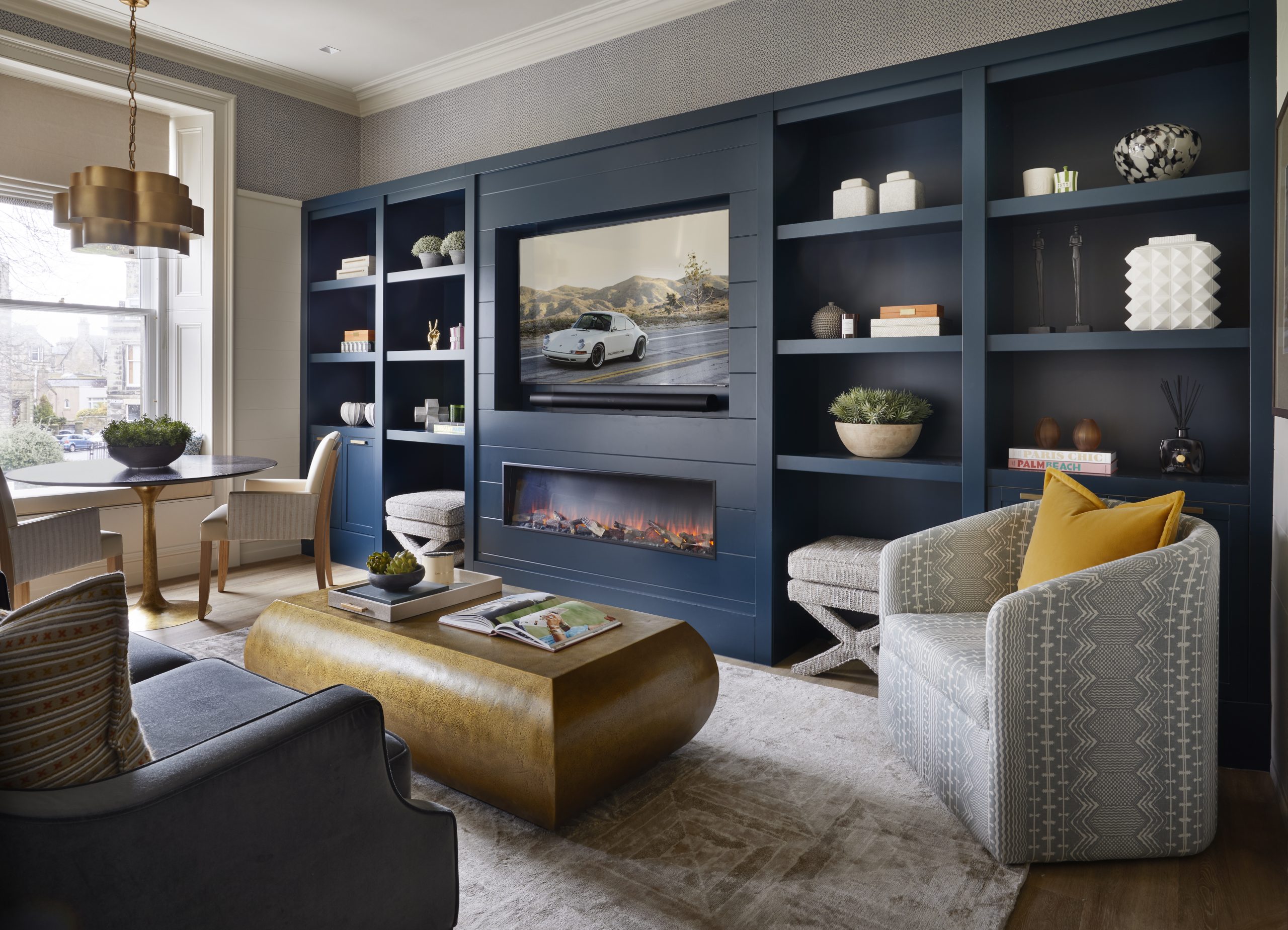
Whilst this deep blue is a ‘big thing’ this year, it is also a timeless colour. We have used shades of the cool hue in many projects to great effect, as an accent through accessories and as a bolder statement on feature walls.
In our Private Townhouse project, we have used rich blues in silks and velvets in the drawing room against a neutral palette, creating a warm and luxurious feel. Classic blue features in the upholstery of the bespoke chaise longue and sofa, enhancing the gold trim. It also carries through into the artwork and accessories to create balance and flow within the room.
At The Manor House Harrogate, designed for Hadrian Healthcare, the restaurant features a soothing and refreshing blue, textured wallcovering. Pops of blue within the dining chairs and curtains bring the scheme together, creating a vibrant and warm interior.
One of our most recently completed projects is Stanbridge Manor, the Audley Club at Stanbridge Earls. Here we’ve used blue as a connecting colour to create flow throughout the rooms of this Grade II* listed Tudor manor house. The colour also complements the rich dark tones of the extensive original panelling.
Blue is versatile – it can have a calming effect or add a dash of drama to a scheme. It always looks fresh and will never go out of style.


